Brand Colour System
Brand Colour System
Quantum Passivhaus uses a purposeful colour system rooted in clarity, contrast, and product meaning. Each colour has an assigned role across digital, print, and environmental applications to maintain consistency and reinforce our product family.
Below is the approved palette and how each colour should be used.
Primary Neutrals
White — #ffffff
Usage:
Primary background colour
White version of the logo
White text on dark backgrounds
White provides clarity, contrast, and a clean canvas for all brand elements.
Light Grey — #f4f4f4
Usage:
Secondary background colour
Section separators
Subtle UI elements
This complements white and adds depth without introducing visual noise.
Brand Accent Colours (Linked to Product Families)
Quantum Orange — #e55f1d
Role: Primary Accent Colour
Usage:
Highlighted text
Icons, graphics, UI elements
Primary buttons
Represents: NCX — Non-Combustible Panel
The orange-red tone symbolizes fire resistance and high-performance enclosure systems.
Quantum Yellow — #f8ab0c
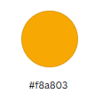
Role: Secondary Accent Colour
Usage:
Secondary buttons
Select icons or emphasized text
Highlights in diagrams
Represents: WCX — Wood-Based Low-Carbon Panel
A warm wood-inspired tone signaling natural, low-carbon construction.
Cold Climate Blue-Grey — #5e7480
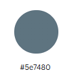
Role: Tertiary Colour
Usage:
Button hover states
Background shapes
Secondary UI elements
Represents: THX — Thermal eXtreme Panel
Reflects cold-climate resilience and high R-value thermal performance.
Structural Neutrals
Dark Charcoal — #2f3233
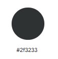
Usage:
Background sections
Card backgrounds
Text over light elements
Provides contrast while maintaining a premium, architectural feel.
Ultra-Dark Charcoal — #111315
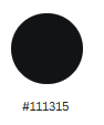
Usage:
Paired with #2f3233 for layered depth
Footer areas
Header bars or dark UI elements
Adds weight and creates hierarchy without using pure black.
Important Note on Black
Quantum Passivhaus does not use pure black (#000000) in brand materials.
Ultra-dark charcoals provide a softer, more modern, and more premium appearance while improving readability and reducing visual harshness.